Most advice on software tutorials gets this backwards. A visible presenter is not a default engagement upgrade. In many product walkthroughs, it is a distraction layered on top of the thing the learner needs to see, the interface.
The better question is not whether a presenter should appear. The better question is which scenes deserve a face, and which scenes get worse because of one. That shift matters for customer education teams, support teams, technical writers, and training producers who are trying to make tutorials clearer without turning every video into a webcam performance.
A software tutorial succeeds when the learner can follow the workflow, trust the explanation, and complete the task afterward. Those three goals do not always want the same format. Presenter video can help with trust, motivation, and human connection. It can also compete with menus, error messages, cursor paths, and dense configuration screens. That trade-off is the whole game when deciding when to use presenter video in a software tutorial.
The Decision Most Tutorial Creators Get Wrong
Presenter video is often treated as a default feature of a polished tutorial. That choice produces bloated walkthroughs, with a face occupying screen space while the learner searches for a dropdown, icon, or setting.
A 2022 meta-analysis of instructional videos with and without an on-screen instructor found no statistically significant overall improvement in learning from presenter presence. Presenter video did significantly increase motivation and cognitive load. Use that finding as a production constraint: the presenter can strengthen the social experience while making a dense interface harder to follow.
Choose scene by scene, not video by video
Decide where a face earns its space:
- Opening scene: Does the learner need reassurance, context, or a reason to care?
- Execution scene: Does the learner need to inspect controls, follow clicks, or copy settings?
- Transition scene: Does the learner need interpretation before moving to the next stage?
- Closing scene: Does the learner need encouragement, a recap, or a recommendation?
This approach matches the format to the learner’s immediate task.
Practical rule: Put the presenter where trust and motivation matter. Remove the presenter where visual accuracy matters.
A customer onboarding video shows the trade-off clearly. A presenter can spend the opening explaining why the dashboard matters and what the learner will accomplish. During a dense workflow, that same face can obstruct a small filter icon, compete with table states, and pull attention away from the cursor. Keep the presenter for motivation and interpretation. Give the interface full priority during execution.
Why the default advice fails
“More engaging” is an incomplete success measure. A learner may enjoy a presenter and still miss the control needed to finish the task. Procedural software training usually benefits more from clean screen capture, sharp narration, captions, and visible cursor movement than from a smiling face parked over the product.
Treat the presenter as a social layer; the learning layer stays with the screen. Show the presenter selectively, at moments where interpersonal guidance improves motivation or trust. Let the interface carry scenes that demand precise observation and imitation.
What Counts as Presenter Video in a Software Tutorial
Teams often blur different tutorial formats under one label, then make bad production choices because the label is too loose. For software training, “presenter video” should mean a visible human on screen, used in specific scenes for a specific reason. If the learner mainly needs to watch the interface and copy actions, that is a different format decision.
The four presenter formats worth distinguishing
Talking head uses a real person on camera, either full frame or in a small picture-in-picture window. The presenter’s job is to frame the task, build trust, interpret decisions, and reassure the learner. Use it where a human presence adds context or confidence. Do not leave it running through every click by habit.
Voiceover screencast keeps the product interface full screen while a narrator explains what the learner is seeing. This is usually the clearest choice for procedural teaching because the interface stays dominant and the learner can follow the exact path without visual competition.
Silent screen capture with captions fits simple steps, noisy viewing conditions, and support content people scan quickly. It also suits help center libraries where learners want a fast answer, not a host. In those cases, readable captions and clean screen motion do more work than personality.
AI-generated avatar creates a visual speaker without filming a real person. That can fit systems built for high-volume updates or low-touch explainers. It sends a different trust signal than a real expert on camera, so treat it as its own format rather than a substitute with the same effect.
Presenter formats at a glance
| Format | Best for | Trust signal | Production cost |
|---|---|---|---|
| Talking head | Onboarding intros, executive explainers, change communication | Strong human presence and accountability | Highest, because camera setup and retakes add work |
| Voiceover with screen capture | Step-by-step workflows, support tutorials, admin procedures | Trust comes from clarity and competence | Moderate |
| Silent screen capture with captions | Help center snippets, quick references, multilingual text-led guidance | Functional, low-personality trust | Low |
| AI-generated avatar | Scaled explainers, repeatable updates, low-touch narration formats | Synthetic, depends on audience tolerance | Moderate |
Where each format shows up
A single tutorial library rarely needs one format only. A product onboarding video may open with a presenter, switch to voiceover for the workflow, then end on screen text or captions for quick recap. An internal SOP often works better as pure screen capture. A support walkthrough for experienced users may not need any camera footage at all.
A face in the corner is a communication choice, and it should have a job.
That distinction matters because the question is not whether to add a presenter everywhere. It is which scenes benefit from one. Strong tutorial systems mix formats based on the learner’s task in that moment. Use visible people for motivation, trust, and interpretation. Use the screen alone for execution and documentation.
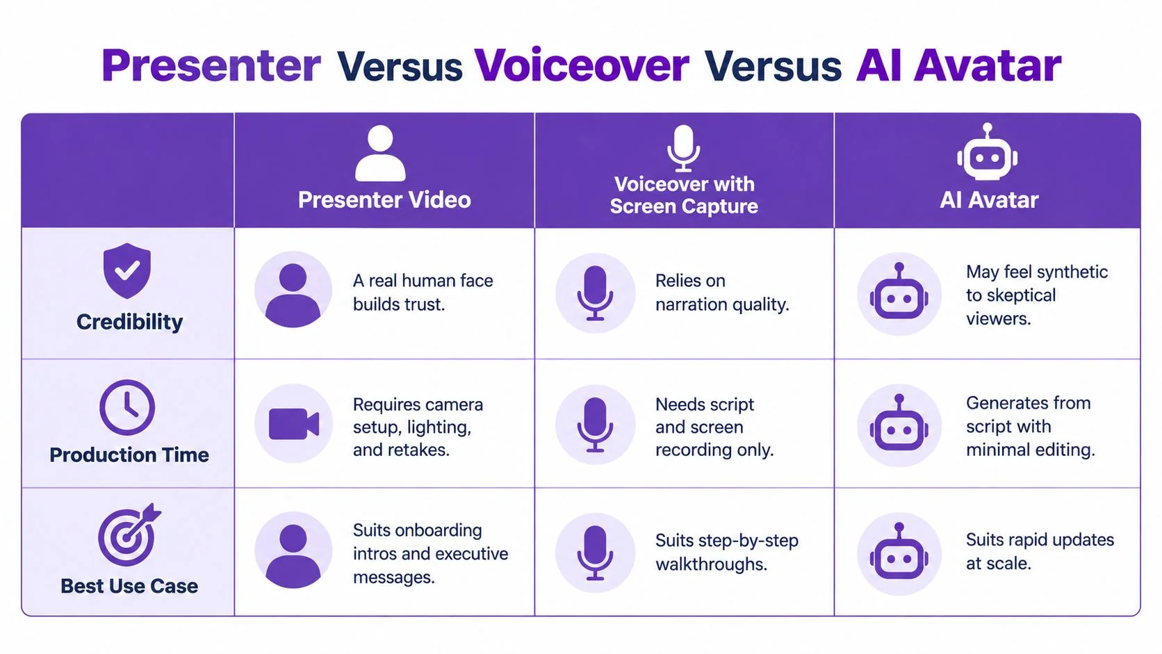
Presenter Versus Voiceover Versus AI Avatar
For software training, the choice usually comes down to three realistic options. A real presenter, a voiceover screencast, or an AI avatar. Each can work. Each also fails in predictable ways.
Where a real presenter wins
A real person carries accountability. That matters in onboarding, customer education, and executive-facing demos. A presenter can signal, “A competent human understands this workflow, and the learner is in good hands.” That is useful when the tutorial is selling confidence as much as it is teaching clicks.
The weakness is obvious. Real presenter footage is harder to update. When the UI changes, teams often have to re-record intros, transitions, or cutaways to keep the video coherent.
Why voiceover stays the default
For dense procedural work, voiceover with screen capture is still the safest default. It keeps the interface dominant, which is exactly what software learners need during configuration, troubleshooting, and exact click-path reproduction.
A 2023 meta-analysis on instructor presence in instructional videos found that visible instructors had a small positive effect on retention, Hedges’ g = 0.22, but no reliable effect on transfer, g = 0.06. The same analysis found larger positive effects for social presence, g = 0.35, affect, g = 0.43, and motivation, g = 0.41. For software teams, that’s the dividing line. Presenter video can make the lesson feel more personal, but it should not be expected to improve users’ ability to perform a workflow automatically.
Where AI avatars fit, and where they don’t
AI avatars sit in the middle. They can offer a presentational layer without requiring a camera setup. That makes them attractive for scaled content operations and frequent updates. But they don’t carry the same trust as a real trainer in high-stakes customer communication.
Teams exploring that route can review AI talking head options for tutorial content and compare them against a simpler voiceover workflow before committing to avatar-led production.
- Choose presenter video for onboarding intros, trust-building, and recommendation scenes.
- Choose voiceover screencast for dense procedures and support content.
- Choose AI avatar only when update speed and consistency matter more than authentic human presence.
The wrong move is pretending these formats are interchangeable. They aren’t.
When Presenter Presence Actually Helps the Learner
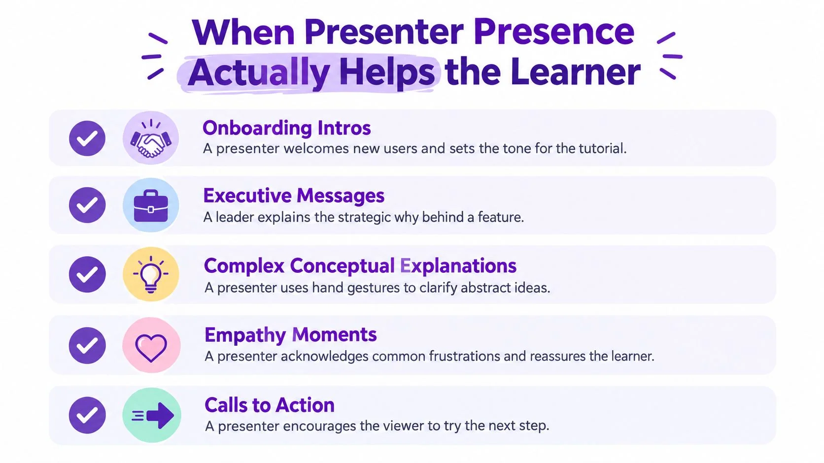
Presenter presence helps when the learning problem is partly emotional, not just procedural. That includes trust, motivation, reassurance, and social connection. It does not include every click-heavy walkthrough.
A 2022 systematic review covering 41 empirical studies concluded that instructor presence generally did not improve learning or social presence, while it increased cognitive load and motivation. For software tutorials, that’s useful because it cuts through wishful thinking. If the scene is visually dense, extra motivation may not justify extra distraction.
The scenes that earn a presenter
A visible presenter usually helps in these moments:
- Onboarding intros: a human welcome reduces distance and clarifies what the learner is about to achieve.
- Executive or stakeholder demos: the presenter carries product positioning and confidence better than a silent screen.
- Change-management messages: when a new workflow disrupts existing habits, reassurance matters.
- Recommendation scenes: “Use this method when…” is stronger when a person delivers the judgment.
- Emotionally loaded tasks: account permissions, billing flows, security steps, and error recovery often benefit from a calm guide.
A 2025 preregistered study on instructor visibility and preference matching reported nearly identical learning performance, around 0.56 versus 0.57 mean scores, whether the instructor was visible or not, though engagement was higher when visibility matched learner preference. That supports a blunt conclusion. Presenter video is a communication layer, not a substitute for good instructional design.
The scenes that should keep the face off
The presenter should disappear when the learner must inspect details:
- Configuration forms
- Small menus and nested settings
- Troubleshooting sequences
- Tooltips, alerts, and error states
- Any step that requires exact reproduction
Teams working on learner-centered production decisions may also find adult learning styles and content choices useful when deciding which scenes need explanation versus execution.
The presenter should explain why a step matters, not sit on screen while the learner hunts for a checkbox.
A persistent face is usually a mistake. Intermittent presence is better because it preserves the social benefit without taxing visual attention during action-heavy segments.
Production Choices That Protect the Interface
A bad presenter setup does more damage than no presenter at all. The screen is the product. If the camera box covers controls, if the microphone buries system sounds, or if the layout turns the UI into an afterthought, the tutorial has failed before the learner reaches step two.
Protect the screen first
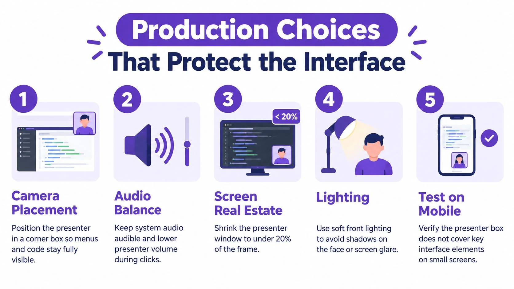
The first rule is visual dominance. The interface should remain larger, sharper, and easier to read than the presenter. A webcam overlay belongs in dead space, not over menus, dialogs, code, or notification banners.
Useful production standards include:
- Keep the presenter small: a corner overlay is usually enough.
- Test layout against the actual product: some dashboards are top-heavy, others bury critical actions in side panels.
- Use clean cutaways: if a full-frame presenter shot appears, it should be brief and purposeful.
- Check mobile playback: a harmless desktop overlay can block key UI on smaller screens.
Teams that want a stronger eye for interface readability should review a practical guide to user interface design. It helps frame the core issue. Every visual element in a tutorial either supports task completion or competes with it.
Get audio and privacy right
Software tutorials often need two audio layers. Microphone audio captures the explanation. System audio captures clicks, alerts, notification sounds, or application playback. These are not the same thing, and they should be checked separately before recording.
Other production choices matter just as much:
- Use a dedicated mic: cleaner voice audio reduces listener fatigue.
- Record a short test clip: confirm keystroke noise, fan noise, and cursor visibility.
- Light the presenter: soft front lighting is enough. Dramatic lighting is pointless in a software tutorial.
- Blur sensitive information before publishing: customer data, internal names, and account details should never slip through. A practical workflow for that is covered in blurring sensitive data in tutorial recordings.
Clean production isn’t cosmetic. It keeps attention on the workflow instead of the flaws around it.
Two Tutorial Scenarios That Change the Answer
The right format changes fast once the tutorial goal changes. That is why blanket advice about presenter video keeps failing. A customer onboarding walkthrough and an admin configuration guide may cover the same product, but they should not look the same.
Scenario one, onboarding for a new analytics dashboard
This tutorial is aimed at new customers who are not yet confident in the product. The first scene should show a presenter briefly introducing the outcome. The goal is not to demonstrate every click immediately. The goal is to tell the learner what they’ll be able to see, why it matters, and how long the walkthrough will take.
A smart scene list looks like this:
- Presenter intro
- Full-screen dashboard tour with narration
- Brief presenter return at the decision point
- Interface-only steps for filtering and saving
- Presenter closing recommendation
That pattern fits the evidence from recent eye-tracking research on talking heads in instructional video. In a study with 96 university students, a talking head reduced fixation duration and the number of fixations on newly appearing instructional content, while delaying the first fixation on that content. It did not improve knowledge, perceived learning, satisfaction, difficulty, or mental effort, and its clearest benefit was higher perceived social presence. That is exactly why the presenter belongs in framing scenes here, not in the filter demo.
Scenario two, admin configuration for permissions and routing
This tutorial has a different job. The audience is an administrator trying to set exact rules in a dense configuration panel. There is almost no value in showing a face during the core steps. The learner needs unobstructed screen capture, deliberate zooming, clear cursor emphasis, and concise voiceover.
The scene list changes:
- Open with a title card or short voice-led preview
- Move straight into full-screen configuration
- Pause at complex branches with annotated callouts
- End with a quick recap of what changed and where to verify it
No presenter is needed unless the workflow carries unusual risk or policy implications. In procedural software training, the cleaner version usually wins.
Scripting and Framing the Presenter Scenes
Once a team has decided where the presenter belongs, the script needs discipline. Most presenter scenes fail because they repeat what the screen already says. That wastes time and makes the face feel ornamental.
What the presenter should actually say
Presenter scenes work best when they do one of four jobs:
- Name the outcome early: what the learner will complete by the end.
- Interpret transitions: why the tutorial is moving from one phase to another.
- Flag decision points: when one option should be chosen over another.
- Close with guidance: what to try next, what to verify, or what common mistake to avoid.
That means weak lines should be cut. “Click settings in the top right” is almost never presenter language. That line belongs in narration or captions over the interface. Presenter language is more useful when it says, “This next setting changes who can edit reports, so accuracy matters here.”
Make the transitions feel intentional
A face appearing and disappearing can be jarring if the switch has no script logic. The handoff should feel earned. One clean pattern is:
- Presenter on: frame the goal
- Presenter off: demonstrate the steps
- Presenter on: interpret the result or next choice
- Presenter off: finish the procedure
A study summarized in ERIC on instructor presence, visual attention, and knowledge domain found that procedural-knowledge videos produced higher transfer scores and greater mental effort than declarative-knowledge videos, but the on-screen instructor itself did not produce differences in mental effort or learning transfer. Both human and animated instructors drew learners’ visual attention, while videos without an instructor directed attention more exclusively to instructional content. For software tutorials, that supports a simple scripting rule. Presenter scenes should carry context and judgment. The screen should carry the procedure.
Short presenter scenes should answer “why this matters” or “what to do next,” not narrate visible clicks.
Captions also need to survive the transition. If the presenter disappears and the caption style changes wildly, the tutorial feels patched together. Consistent caption placement and tone keep the format changes from becoming their own distraction.
Putting It Together and Avoiding Common Pitfalls
The cleanest rule is this. Show the presenter at the beginning, at major transitions, and when explaining why a workflow matters. Remove the presenter during dense procedures, troubleshooting, and exact reproduction steps. That is the practical answer to when to use presenter video in a software tutorial.
The most common mistakes are predictable:
- Leaving the presenter visible during click-heavy demos
- Covering controls, tooltips, or alerts with the webcam box
- Letting personality replace instructional clarity
- Ignoring captions and visual guidance
- Treating every tutorial as either all-face or no-face
A sane production workflow
A strong workflow starts with a clean screen recording of the task. One recording can then support more than one output. A video version may use selective presenter scenes, while the same source material becomes a written guide with screenshots and steps for the help center.
That’s where a recording-first approach is more useful than overproduced filming. Tutorial AI fits that workflow as one factual option among others. A team can record a real software process, generate a tutorial video and written guide from the recording, then review and edit the script, narration, steps, and visuals before sharing the result. That suits software training, onboarding, SOPs, product walkthroughs, and support content where the expert already knows the task but doesn’t have time to script, edit, and document it separately.
The final test
Before publishing, teams should ask three blunt questions:
- Does every presenter scene earn its screen space?
- Can the learner still see every critical interface detail?
- Is the face helping trust or motivation, rather than stealing attention from the task?
If the answer to any of those is no, the presenter should be cut.
Teams that already record product walkthroughs can use Tutorial AI to turn one screen capture into a polished tutorial video and a written guide, then edit the script, narration, steps, and visuals before publishing. That makes selective presenter use much easier to manage, because the workflow stays centered on the software itself instead of forcing every tutorial into a camera-led format.