You’re probably staring at a help center that has grown in every direction, with repeated questions buried in tickets, a few stale answers, and no clear path for users who just want one fast reply. That’s usually when an FAQ page stops being “nice to have” and becomes the page that saves the support team. Strong faqs page examples don’t just list questions, they connect search, clear navigation, and escalation paths so people can solve simple issues without opening a ticket. For a privacy-first chat assistant reference, see this privacy-first chat assistant info.
1. Stripe Help and Support
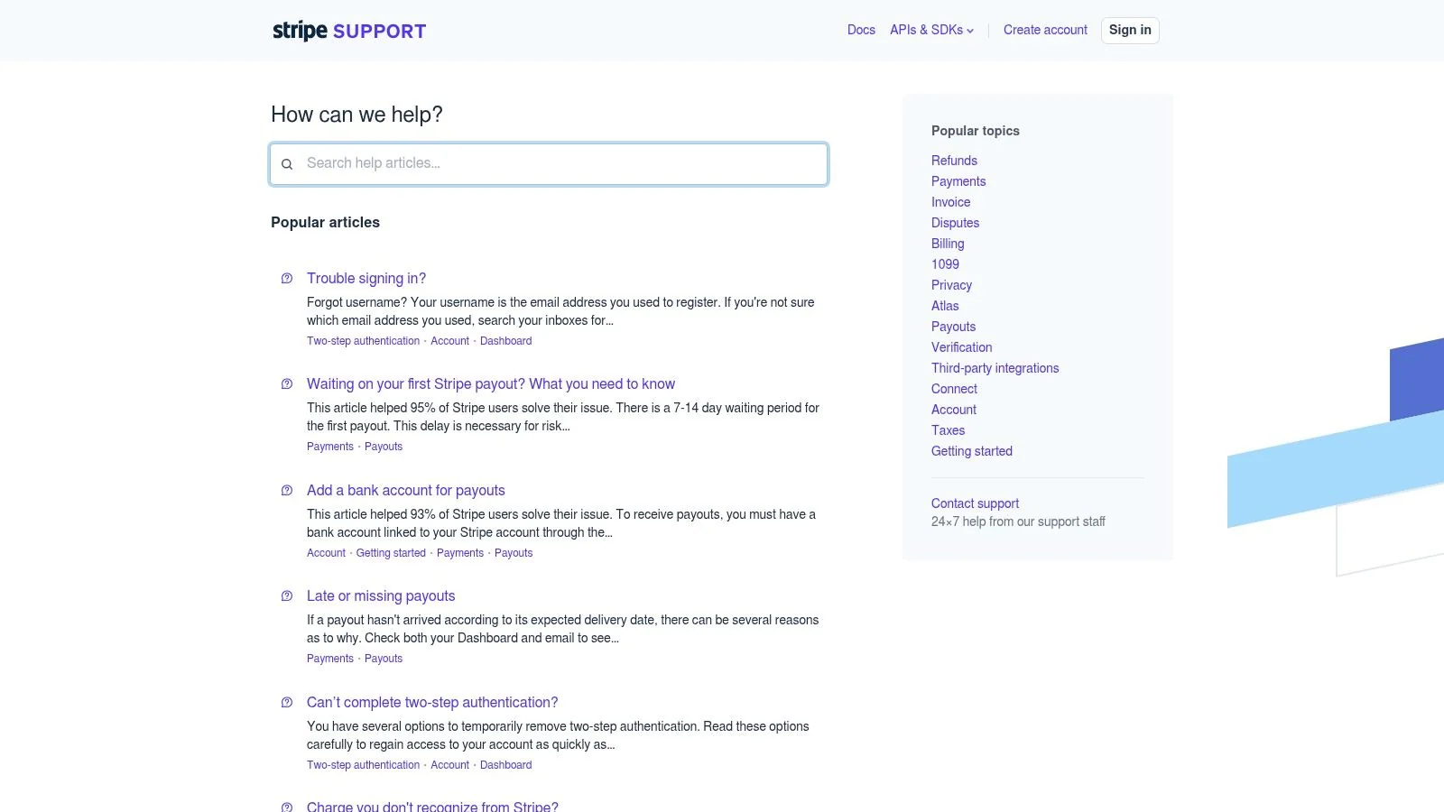
Stripe’s support hub is a strong model for teams that need one page to serve merchants, admins, and developers without making any group feel lost. The structure works because it’s search-first, highly organized, and built around the fact that different users arrive with different intents. The Stripe Help and Support hub is also a useful reminder that FAQ content gets stronger when it links out to deeper product documentation instead of trying to solve every issue in one block.
What works here
Stripe’s information architecture is the main lesson. Public help articles, localized country and language pages, and in-article support contact flows reduce the chance that a user lands on the wrong answer and gives up. Cross-links to status, privacy, and product docs make the page feel like a routed system, not a dead end.
A useful pattern to borrow is the search-first top layer plus deep links for advanced users. If your product has developers, operations staff, and everyday customers, don’t force them into the same question list. Split the entry points, then let the article content converge on the right answer.
Practical rule: if one FAQ entry starts serving three audiences, it’s probably too broad. Split it before it turns into a support maze.
How to adapt it for video-based help
This is a good fit for Tutorial AI-style documentation because one recording can become both a tutorial video and a help article. For example, a billing or payout FAQ can include a short screen recording showing the exact steps, then link to a written explainer generated from the same source. That keeps the UI demonstration and the support copy in sync, which matters when policies or interfaces change often. If your team publishes setup instructions, the AI for documentation workflow can turn one walkthrough into a usable support asset without duplicate writing.
2. Zoom Frequently Asked Questions
Zoom does something smart that many teams skip, it separates starter questions from admin questions and then pairs both with short training content. The Zoom Frequently Asked Questions page works because users can read a direct answer, then move into a micro-video or training module when the task needs more explanation. That’s a stronger experience than trying to explain every workflow in a single wall of text.
Why the format helps
For onboarding and admin questions, people often need a quick text answer first and a visual second. Zoom’s Learning Center pairing gives them both without forcing the FAQ page to become an encyclopedia. The “top resources” style roundup is useful too because it gives users a next step when the first answer doesn’t fully solve the problem.
The trade-off is navigation discipline. When FAQ content, trainings, and community resources live in separate places, the page needs clear labels or users will bounce between tabs instead of moving forward. That’s the right moment to keep FAQ answers short and to the point, then route to a richer lesson for workflows that need more context.
Copy pattern worth borrowing
Use a structure like this:
- Question: What’s the fastest way to start a meeting?
- Answer: Open the app, create the meeting, and share the invite link. If you need the admin steps, follow the setup guide below.
- Deep link: Link the user to the learning module or tutorial video.
That pattern keeps the FAQ answer usable on its own and makes the video optional rather than mandatory. It’s especially effective for support content where users want action, not a lecture.
3. Slack Help Center and Topical FAQs
Slack’s help center is a strong example of using topical FAQs to reduce pricing, plan, and billing confusion before it turns into sales-assist noise. The Slack Help Center combines plan comparisons, policy detail, and guided contact flows, so users can self-serve first and escalate later. That works better than packing every question into one general FAQ page.
The UX lesson
The strength here is intent separation. Plan reviewers need feature comparisons, while users with access issues need troubleshooting paths, and billing questions sit in a different lane again. Slack’s topical structure keeps each path narrower and easier to scan, which matters when the user is already frustrated.
A guided contact flow does more than collect a ticket. It can triage the issue before escalation, which gives the support team better context and saves the customer from repeating the same details. That setup fits products with several customer types, especially when support responsiveness varies by plan.
Plain truth: a good FAQ page should answer the obvious questions and route the hard ones somewhere better.
How to reuse the pattern
For your own FAQ page, separate plan, billing, and feature-access questions under different headers instead of blending them together. Use plain-language labels that match the way customers describe the problem. If your product includes onboarding or implementation topics, pair the text with a short walkthrough video and a deeper setup article so users can choose the format that fits their needs.
Clear internal navigation matters too. Nielsen Norman Group’s guidance on information architecture and scannability supports this approach, since users tend to find content faster when categories are obvious and labels reflect their own language. If a customer has to decode your content structure before they get an answer, the page is working against them.
4. Canva Help Center
Canva’s help center shows how visual content can make an FAQ feel useful instead of purely informational. The Canva Help Center pairs task-based answers with embedded media, then extends learning through Design School and Academy resources. That combination is especially strong for software where people learn by watching.
Where this model shines
Creative tools often need “how do I” answers that are easier to understand visually than in text alone. Canva handles that well by using screen recordings, GIFs, and tutorial content inside the support ecosystem. It also links to a status page, which helps users self-diagnose whether the issue is theirs or a platform incident.
That said, visual support works best when the handoff is explicit. If a chatbot or automated flow sits in front of the human path, users should know exactly when they’ll get an actual person. Otherwise, the page may feel polished but not dependable.
Reusable content pattern
A strong FAQ entry here usually looks like this:
- Question: How do I resize a design?
- Answer: Open the editor, select Resize, choose the new dimensions, and save the updated version.
- Visual support: Add a short screen recording or GIF.
- Deeper help: Link to a full tutorial article.
That structure keeps the FAQ short while making the visual asset do the heavy lifting. It also pairs well with Tutorial AI’s video-to-article workflow, because one recording can become both the walkthrough and the written support page. For teams building how-to content, that’s the cleanest way to keep text and video aligned without duplicating production work.
5. Dropbox Help Center
Dropbox is a useful example of a support system that doesn’t pretend every customer wants the same path. The Dropbox Help Center uses popular topics, category hubs, and a clearly signposted “Other ways to get help” block to guide users from self-service to community to ticket. That three-tier approach is practical, because it sets expectations before someone gets stuck.
Why the structure matters
The biggest win here is escalation clarity. Users can start with a knowledge base article, move to community support if they need peer input, and then open a ticket when the issue really needs direct intervention. That saves time on both sides because the support team isn’t forced to act like a search engine.
Dropbox also handles product-specific FAQs without making every page feel duplicated. Shared content stays shared, while product-level pages handle the edge cases. That’s the right move if your portfolio includes multiple tools or user types, because copy reuse only helps when it doesn’t flatten the details.
Use this standard: if your page includes support, community, and learn links, label each one by outcome, not by internal department.
What to borrow
Build one obvious escalation block near the bottom of your FAQ page. Keep it simple, with clear choices like knowledge base, community, or contact support. Then make sure the answer content itself is short and self-contained, so users don’t have to read the whole site to finish a task.
That approach works well for product documentation teams that want to reduce repetitive tickets without hiding human help. It gives users a path out when the answer isn’t enough, which is what a mature FAQ should do.
6. Figma Pricing FAQs and Help Center Integration
Figma’s pricing FAQ is a strong example of how a focused page can prevent sales and billing confusion before it starts. The Figma pricing FAQ keeps the page narrow, then points users to deeper help articles and status information when they need more context. That’s a good model for any product with plan differences, feature gates, or policy questions.
The strategic value
Pricing FAQs work best when they answer edge cases clearly. People aren’t just asking what a plan costs, they’re asking what’s included, what changes by account type, and what happens when access shifts. Figma handles that by keeping the answers authoritative and direct, which helps users make a decision without opening a support thread.
The downside of distributed learning content is navigation cohesion. When pricing, tutorials, blog posts, forums, and video content live in different places, users can lose their place. The FAQ page therefore needs strong cross-links and a clean path into the next layer of help.
Copy pattern for plan confusion
Try this approach:
- Question: Does this plan include the feature I need?
- Answer: Yes, if your plan includes the feature, you’ll see it in the product menu. If not, check the plan comparison or help article linked below.
- Next step: Link to the detailed policy or status page.
That style keeps the answer short while still handling the common objection. It also gives support teams a better starting point when the user does need help. For teams publishing support videos, pairing this with a short screen recording makes the plan explanation easier to absorb than text alone.
7. Webflow Help Center and University
Webflow is a good example of a support system that treats FAQs and learning content as separate but connected layers. The Webflow Help Center gives users category hubs and common questions, while Webflow University handles deeper skill-building. That split is useful because it respects the difference between a fast answer and a teachable workflow.
What makes it effective
The page architecture gives users a choice. If they need a quick fix, they stay in the help center. If they need to understand the underlying process, they move into a course-style lesson. That’s especially valuable for web tools where a single question can lead to a larger build decision.
Webflow’s first-party FAQ UI examples are also useful because they show how FAQ patterns can be taught inside the product education layer itself. That means the content isn’t just explaining the software, it’s showing users how to structure information inside their own sites. For content strategists, that’s a good reminder that help content can teach design patterns, not just product steps. If you’re building a knowledge base, the knowledge base article template is a useful starting point for packaging those steps cleanly.
Practical takeaway
Keep the FAQ page focused on quick answers, then let the deeper course or tutorial carry the process. That prevents the support article from becoming bloated and gives users a clear next move when they’re ready for it. For software teams, this split is often the difference between a page that gets skimmed and a page that resolves the issue.
Top 7 FAQ Page Examples Comparison
| Title | Implementation Complexity 🔄 | Resource Requirements ⚡ | Expected Outcomes ⭐📊 | Ideal Use Cases | Key Advantages 💡 |
|---|---|---|---|---|---|
| Stripe – Help & Support | 🔄🔄🔄 High, search, localization, auth escalation | ⚡⚡⚡ High, content, intl, engineering | ⭐⭐⭐ 📊 High deflection; serves merchants, admins, engineers | Global payments platforms; developer-first products | Strong IA; localized FAQs; context-aware escalation |
| Zoom – Frequently Asked Questions | 🔄🔄 Medium, FAQ + Learning Center integration | ⚡⚡ Medium, video/LMS production | ⭐⭐ 📊 Faster task completion; improved onboarding | Products needing bite-size training and demos | Video + microlearning; clear user/admin split |
| Slack – Help Center + Topical FAQs | 🔄🔄 Medium, guided intake and triage flows | ⚡⚡ Medium, content + triage logic | ⭐⭐ 📊 Reduces billing/sales tickets; solid troubleshooting | B2B SaaS with tiered plans and billing queries | Plan clarity; guided triage; searchable how‑tos |
| Canva – Help Center | 🔄🔄 Medium, rich media + tutorial microsites | ⚡⚡⚡ High, media creation and course content | ⭐⭐⭐ 📊 Strong reduction in “how‑to” tickets; visual learning | Creative tools where visual guidance matters | Rich step‑by‑step media; Design School integration |
| Dropbox – Help Center | 🔄🔄 Low‑Medium, category hubs + escalation paths | ⚡⚡ Medium, KB, community curation | ⭐⭐ 📊 Clear escalation; community‑curated solutions | Products benefiting from KB → community → ticket model | Three‑tier support model; clear contact paths |
| Figma – Pricing FAQs + Help Center integration | 🔄 Low, focused, concise pricing Q&A | ⚡⚡ Low‑Medium, maintain pricing/policy docs | ⭐⭐ 📊 Reduces billing/sales confusion; clarifies policy | Pricing/plan clarity and edge‑case billing questions | Concise authoritative FAQ; strong cross‑links |
| Webflow – Help Center + University | 🔄🔄 Medium, help + course‑style tutorials | ⚡⚡ Medium, course and article production | ⭐⭐ 📊 Balances quick answers with skill building | Platforms needing both quick FAQ and deeper training | University lessons; first‑party UI examples and tutorials |
From Examples to Execution
The strongest FAQ pages share the same habits. They’re built from real customer questions, they stay tightly organized, and they use concise answers with clear paths to deeper help. That matches current guidance to pull recurring questions from support tickets, chat logs, emails, and internal search data, then organize them into logical categories and keep answers concise. It also matches the practical advice to keep FAQ pages small and scannable, usually around 10 questions or fewer before grouping similar topics under headers, while using search bars and tracked performance metrics to improve the page over time. You can see those patterns reflected across the examples from Stripe, Zoom, Slack, Canva, Dropbox, Figma, and Webflow.
The other lesson is that FAQ pages shouldn’t be treated as static text. They work better as a support system that includes search, contact escalation, related articles, and, when needed, video. That’s where a tool like Tutorial AI fits naturally. It takes a single screen recording and narration, then turns it into a polished tutorial video and a matching written article, which makes it easier to keep help content, support docs, and product walkthroughs in sync.
For product teams, the practical move is simple. Start with the questions customers already ask, group them by intent, and write answers that stand alone without forcing users into another page unless they need it. Then layer in videos, status links, and clear escalation paths so the FAQ becomes a real self-service surface, not just a list. If your support load keeps creeping up, use Tutorial AI to turn one walkthrough into both a video and a help article, then publish them together so customers can watch, read, and solve the issue in one pass.
If you want your FAQ pages to do more than sit in the footer, use Tutorial AI to turn real product walkthroughs into polished support videos and matching help articles from the same recording. That keeps your answers consistent across text and video, which is exactly what high-volume support teams need. Visit Tutorial AI to start building FAQ-ready documentation that your customers can use.