A lot of software teams already have the hard part handled. The product demo is clear. The screen recording is sharp. The script is solid. Then the face-cam comes in and the whole thing looks cheaper than it should. Flat light from a monitor, dark eye sockets, reflections in glasses, and a background that blends into the presenter.
That mismatch is common in tutorial production because most advice on the best videography lights is written for vloggers, filmmakers, or streamers. It usually assumes you're lighting a person as the entire subject. Tutorial teams have a different problem. You're lighting a person who has to coexist with UI overlays, cursor motion, captions, and a bright screen sitting inches away.
From Webcam Glow to Studio Polish
If you record onboarding videos, support walkthroughs, feature release clips, or sales demos, you've probably seen this exact failure mode. The product looks polished on screen, but the presenter looks like they're lit by a refrigerator bulb. That instantly changes how viewers judge the whole piece.
This is also why generic “buy a ring light” advice falls apart for SaaS content. A tutorial setup has to manage screen glare, desk space, and mixed light from monitors and windows. It also has to look stable across repeat sessions, because knowledge base teams don't shoot once. They shoot continuously.
The gap is real. General lighting coverage still leaves tutorial creators underserved, and one cited example notes frequent unanswered questions such as “best lights for screen recording with facecam?” while also stating that 70% of tutorial creators reported lighting as a top pain point in a 2025 SaaS content survey in Digital Camera World's video light guide.
Good tutorial lighting doesn't need to look cinematic. It needs to look clean, repeatable, and trustworthy.
That changes the buying criteria. You usually don't need the biggest light. You need a light that gives you a flattering face, doesn't contaminate the screen image, and fits around a laptop, mic arm, and second monitor. If you're building a repeatable process for your team, start with a practical workflow for making a tutorial video, then build your lighting around that workflow instead of treating lighting as a separate gear hobby.
The Foundation of Good Lighting Three Point Setups
Three-point lighting sounds more complicated than it is. It's just a way to give a face shape. Think like a sculptor. One light creates form, one softens the rough edges, and one separates the person from the background.
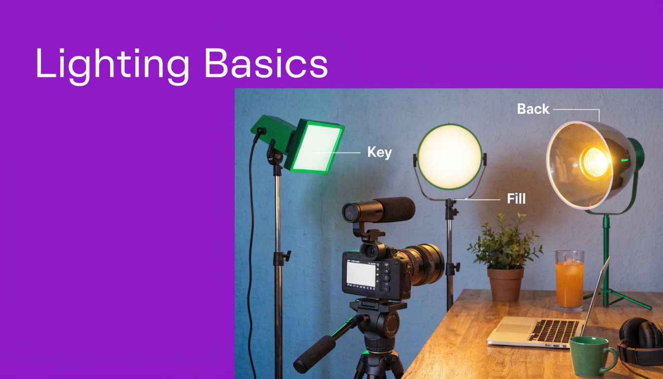
Key light
The key light does most of the work. Put it slightly to one side of the camera and a bit above eye level. That angle creates shape on the face instead of blasting it flat from straight ahead.
For tutorial creators, the key light matters more than anything else. If you only buy one serious light, buy the one that can serve as your key. A decent bi-color LED panel or a COB light with a softbox is usually the right starting point.
Fill light
The fill light reduces the shadow created by the key. It shouldn't erase the shape. It should just make the shadow side look intentional instead of murky.
In small offices, the fill doesn't even need to be a second powered fixture. A white wall, reflector, or bounced light often works. That's useful when your desk already has too much hardware on it.
If you want a solid visual primer, ClipCreator.ai's lighting secrets cover many of the same practical decisions that matter when you're lighting a person for recorded video rather than a live call.
Back light
The back light sits behind the subject and creates separation from the background. Without it, dark hair on a dark chair against a dark wall turns into a blob. With it, the person looks cut out from the room in a good way.
That's especially valuable in software tutorials because your viewer is already tracking a lot of visual information. Separation helps the presenter read clearly at a glance.
A simple rule set helps:
- Key first: Put your best light here.
- Fill second: Add only enough to keep shadows from looking harsh.
- Back last: Use it to separate, not to create a halo.
Later, when you refine placement, this basic pattern becomes much easier to adjust. Tutorial AI's own guide to lighting for video recording is useful if your team wants a simple operating baseline for internal recording standards.
Once you see the pattern, setup gets faster.
Decoding Light Specs What Really Matters
Most bad lighting purchases happen because people shop by wattage, not by output quality. For tutorial videos, the spec sheet matters. Just not the way many product pages imply.
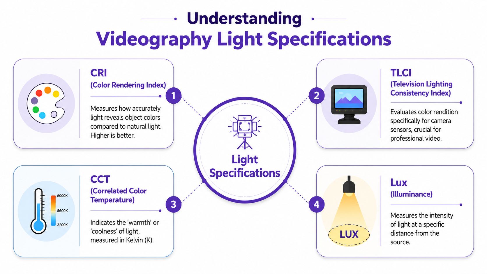
CRI and TLCI
Start with CRI and TLCI. These tell you whether colors will look believable on camera. A poor light can make skin look strange, flatten reds, and create footage that's annoying to correct later.
Professional lighting standards have shifted toward these metrics. CRI 95+ has become the industry standard for professional-grade photo and video lighting, and TLCI of 90 or higher is recommended to avoid difficult-to-correct color deviations in footage, according to GVM's explanation of CRI and TLCI.
That matters more in tutorial production than people think. If your face-cam sits beside polished interface footage, any ugly color cast becomes obvious. The cleaner your light, the less the presenter clip feels like an afterthought.
Practical rule: If a light listing hides CRI and TLCI, treat that as a warning.
There's another metric worth noticing in better lights: R9, which refers to deep red rendering. For presenters, that affects skin tones, lips, and natural-looking warmth. If skin looks waxy or grayish, weak red rendering is often part of the problem.
CCT and bi-color control
CCT is color temperature, measured in Kelvin. It's the difference between warm light and cool light. In practical terms, this decides whether your setup looks cozy, clinical, natural, or mismatched.
For tutorial teams, bi-color lights are usually the safer choice because you're often shooting in changing environments. One room has daylight from a window. Another has warm office lighting. A fixed-color light can work, but it's less forgiving.
Use warmer settings when you want a softer, friendlier look for onboarding or customer education. Use cooler settings when you want a crisp, technical look for product demos and walkthroughs.
Lux and real-world intensity
Lux measures illuminance at a given distance. It's closer to a usable brightness number than wattage alone. The key point is whether the light can deliver enough output after you soften it.
Soft light looks better on faces, but diffusion cuts intensity. That's why tiny desk lights often disappoint. They look fine on paper, then collapse once you add a diffuser or move them farther away.
For detailed motion work, one source notes a minimum of 500 lux, with 1,000 lux or more recommended for optimal results, in Kenro's camera lighting buyer's guide. In practice, that doesn't mean every tutorial desk needs a blinding fixture. It means you should be wary of ultra-small lights that only look strong when placed uncomfortably close to your face.
Dimming and control
Modern LED gear has also changed how usable lights feel in daily production. Good fixtures now offer 0 to 100% dimming, which gives you a wide adjustment range without forcing ugly compromises on exposure or placement. That's one reason LED has become the default choice for many video teams. You can tune the light to the room instead of fighting the room.
When you're shopping for the best videography lights, the short version is simple:
- Prioritize color accuracy: Look for strong CRI and TLCI.
- Prefer bi-color flexibility: It saves headaches in mixed environments.
- Check usable output: Bright enough after diffusion is what counts.
- Demand smooth dimming: Fast, repeatable adjustment matters on working teams.
Choosing Your Weapon A Guide to Light Types
The best videography lights for software tutorials usually fall into three camps: LED panels, ring lights, and COB lights with softboxes. All three can work. They just solve different problems.
LED panels
Panels are the easiest recommendation for most SaaS teams. They mount cleanly, fit on small stands, and don't eat your whole desk. They're also fast to adjust when one person records after another.
Modern LED panels use arrays of small LEDs, and many include bi-color control that lets you switch between 3200K and 5600K without changing fixtures, as described in SmallRig's studio lighting guide. That flexibility is useful when the same room has to handle customer training one day and a sharper product demo the next.
Panels are not always the prettiest light source, but they're efficient. For a face-cam next to screen capture, efficiency often beats romance.
Ring lights
Ring lights became popular because they're simple. Put the camera in the middle, get even frontal light, and you're usable fast. For solo creators, that convenience is real.
The trade-off is the look. Ring lights flatten facial shape and often create obvious reflections in glasses. They can also look too “content creator” for a formal tutorial or internal training library. If your team wears glasses on camera, ring lights become much less attractive.
A ring light fixes darkness fast. It doesn't usually create the most credible tutorial look.
COB lights with softboxes
COB lights paired with a softbox produce the nicest key light of the three. They give you soft, directional light with more shape and more control than a typical panel. If you have a dedicated recording corner, this setup often looks the most polished.
The downside is footprint. Softboxes take space. They need stronger stands. They're slower to move, slower to store, and less friendly in cramped deskside setups. In a shared office, a great COB setup can become the thing nobody wants to assemble.
Quick comparison
| Light Type | Best For | Footprint | Pros | Cons |
|---|---|---|---|---|
| LED Panel | Desk tutorials, support videos, repeatable team setups | Small to medium | Fast setup, bi-color options, easy to place near monitors | Light can look a bit harder unless diffused |
| Ring Light | Solo recording, quick face-cam, minimal setup knowledge | Small | Easy to use, centered lighting, compact | Flat look, glasses reflections, less flattering shape |
| COB with Softbox | Dedicated home studio, premium talking-head demos | Medium to large | Soft, professional-looking key light, strong control | Takes space, slower setup, less desk-friendly |
If your content team records frequently and shares gear, panels are usually the safest default. If one person has a dedicated studio corner, a COB setup often wins. Ring lights are fine when speed matters more than nuance.
Lighting Setups for Every Tutorial Scenario
Many creators don't need abstract theory. They need a setup that works in the room they already have. These are the three arrangements I'd use most often for software tutorials.
The desk warrior
This is the common case. Laptop, external monitor, USB mic, maybe a webcam on a small arm, and almost no spare space.
Use a two-light setup. Put your main bi-color panel slightly off to one side of the camera and above eye level. Angle it down so it lights your face, not the monitor. Then add a weaker fill on the opposite side, or bounce your key into a wall if the desk is crowded.
The main mistake here is placing lights too low or too front-on. That creates glare on glasses and fights with monitor light. Raise the key, move it off-center, and let the screen stay dim enough that it doesn't become your real key light.
The home studio
If you've got a dedicated recording area, use a proper three-point setup with a COB key in a softbox, a restrained fill, and a back light behind the chair or slightly off to the rear side.
This arrangement gives the presenter authority without making the video feel overproduced. It's especially useful for onboarding libraries, product education, and executive-facing explainers where visual consistency matters. Keep the background simple. A practical lamp or muted shelf light is fine, but avoid letting the background compete with the screen content.
For teams that also run a lot of live calls, many of the habits overlap with improving your video conference lighting, especially around eyeglass reflections, front-facing shadows, and balancing ambient room light.
The road warrior
Sales engineers, SDRs, trainers, and field teams often need something lighter. In that case, one portable key light is more useful than carrying a half-studio that never leaves the bag.
A battery-powered LED or compact COB with diffusion works well for hotel rooms, temporary desks, and customer offices. Post-2025 releases such as the SmallRig RC 220B Pro and GVM SD80D are noted as offering 2+ hours of battery life at full power, which makes cord-free recording more realistic for mobile demos, according to this YouTube roundup discussing portable lighting options.
Use the wall as your helper. If you don't have a fill light, bounce the main source into a pale surface. If the background is ugly, move closer to the camera and let the light fall off behind you.
Placement rules that save time
- Keep lights above the screen line: This reduces glare and “monitor face.”
- Separate subject from background: Even a small back light or background distance helps.
- Match the room before you overpower it: Don't fight every ambient source. Control the worst one.
- Test with your glasses on and your brightest screen open: That's the actual setup, not the idealized one.
Beyond Lighting Making Videos Shine with Tutorial AI
Lighting gets you clean raw footage. It doesn't solve pacing, awkward pauses, rambling narration, or the endless cleanup that drags tutorial production down.
That's the part many teams underestimate. Easy recording tools are great for speed, but recordings made that way are often 50% to 100% longer than necessary. On the other end, tools like Camtasia or Adobe Premiere Pro can absolutely produce polished work, but they demand editing discipline and software skill that most subject matter experts don't have.
The practical middle ground is to capture better footage up front, then use software that removes the timeline burden. A well-lit face-cam helps every downstream edit look cleaner. Cursor emphasis reads better. Zooms feel intentional. Captions look like part of a designed system instead of a rescue operation.
That's where Tutorial AI's AI video workflow fits for screen-based content. It turns raw screen recordings into tutorials, demos, onboarding videos, support article videos, and knowledge base assets without requiring the person recording to edit like a professional in Premiere. A subject matter expert can speak naturally, skip memorizing a polished take, and still end up with output that looks tightly edited and on-brand.
Why lighting still matters when AI handles the edit
AI editing isn't a replacement for decent capture. It's a multiplier for decent capture. If your face is muddy, green, or hidden behind reflections, every automatic enhancement has worse material to work with.
A good setup gives the software clean edges, believable skin tone, and stable exposure. That improves the final result whether you're adding smart zooms, blurs, subtitles, or translated narration. If you're comparing broader workflow options, this roundup of top AI tools for content creators is useful context for how teams are blending capture and post-production tools today.
Clean lighting doesn't make a tutorial impressive by itself. It makes every edit look more intentional.
Troubleshooting Common Lighting Problems
Even a decent setup can fail in annoying ways. Usually the fix is small.
Glasses glare
If you see bright rectangles in glasses, your light is probably too frontal or too low. Raise it and move it farther to the side. If that doesn't solve it, tilt the glasses very slightly downward or raise the camera a bit so the reflection bounces away from the lens.
Avoid assuming the ring light is innocent. It often causes the most obvious reflections.
Screen glare on the face
If one side of your face looks blue or washed out, the monitor is acting like an uncontrolled light source. Lower screen brightness, switch dark UI themes when possible, and make your key light clearly stronger than the monitor.
This problem is common in product demos because people open bright interfaces and forget that the screen is now part of the lighting setup.
Orange or strange skin tone
This usually comes from mixed light. A warm desk lamp, cool window light, and a bi-color key set somewhere in between can make skin look wrong even if each source looks acceptable alone.
Try this order:
- Turn off bad ambient lights first
- Set the key to match the main room source
- Adjust camera white balance after the light is stable
If the fixture itself is the problem, the issue may be poor color quality rather than bad placement.
Harsh shadows and tired-looking eyes
A small bare light close to camera can still look harsh. Add diffusion, increase the size of the source, or bounce the light off a nearby wall. Softness comes from apparent size, not from wishful thinking.
If the eye sockets look dark, the light may be too high. Lower it slightly while keeping it above eye line.
Flat image with no separation
If the presenter blends into the chair, wall, or background blur, create depth. Move the chair farther from the wall. Add a small back light. Let the background fall a bit darker than the face.
This is one of the easiest wins in tutorial video because it doesn't require more expensive gear. It usually requires better spacing.
The room looks cluttered
Lighting can hide some clutter by drawing attention to the subject and letting the background fall off. It can't fix a chaotic frame. Remove obvious distractions, simplify what's visible, and use your light to support that cleanup.
The best videography lights won't rescue a bad composition. They will make a clean composition look authoritative.
If your team creates demos, onboarding videos, explainer videos, feature release videos, or support content, Tutorial AI gives you a way to turn well-lit screen recordings into polished tutorials without timeline-heavy editing. That's useful when subject matter experts need to record quickly, speak naturally, and still publish videos that look consistent with your brand.